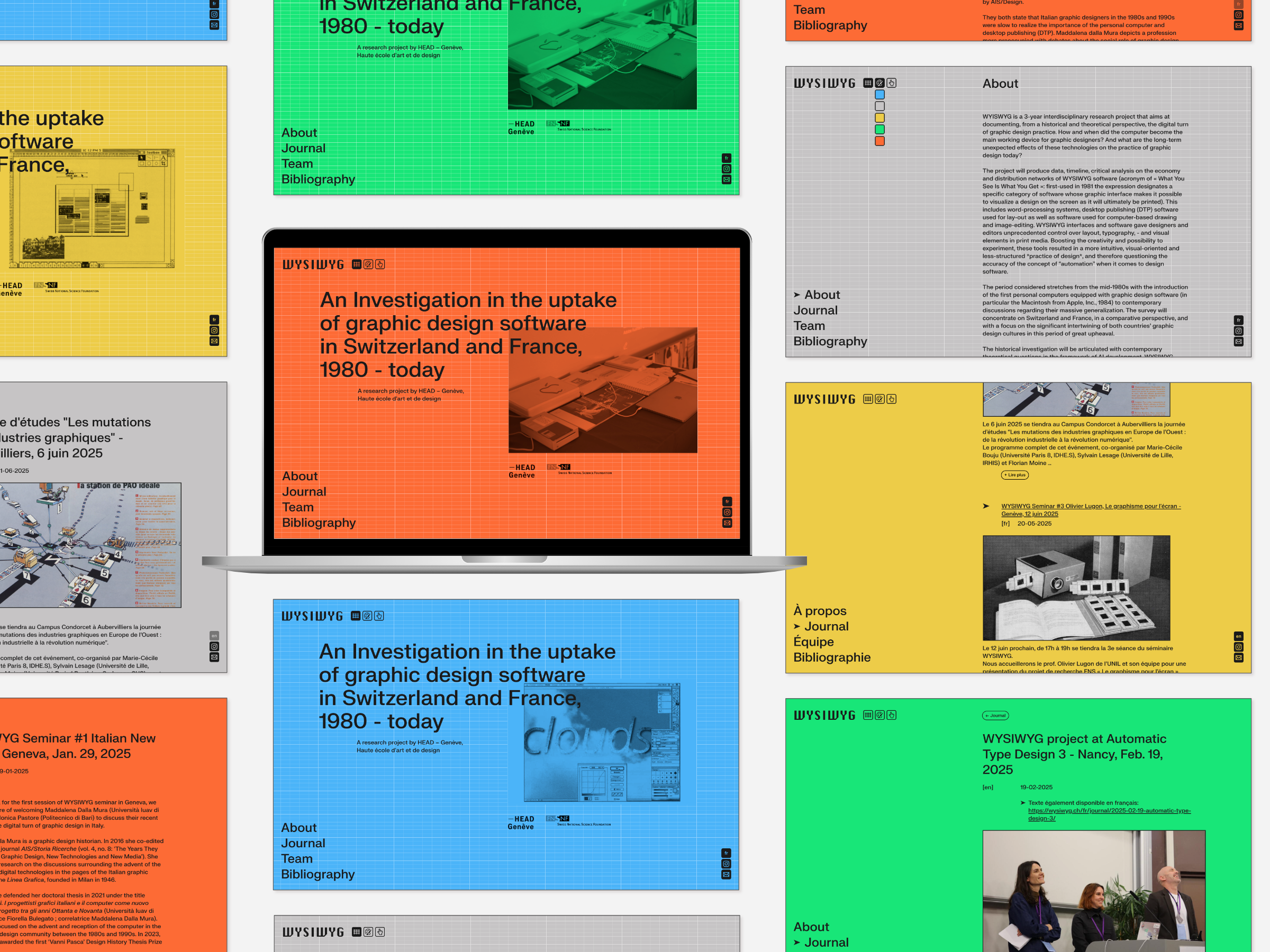
WYSIWYG, acronym of “What You See Is What You Get”, refers to a specific category of software whose graphic interface allows users to preview on screen a design exactly as it will appear once printed. The WYSIWYG project aims to document, from a historical and theoretical perspective, the evolution of graphic design software in Switzerland and France from 1980 to the present day.
Some graphic choices:
- A Swiss-inspired typeface: a grotesque sans serif.
- A single font weight, with a hierarchy built through grid, spacing, and typographic scale rather than typographic contrast.
- A “logo” paying homage to the early Macintosh interface, which popularized WYSIWYG thanks to its commercial success. The typeface used is Chicago, designed by Susan Kare for Apple Computer.
The site’s logo is accompanied by three interactive icons containing easter eggs. They reference essential WYSIWYG functionalities: the grid, the colour palette, and the ability to move elements with the mouse. When activated, they allow users to interact with the website: showing or hiding the grid, changing the background colour, or moving elements around to deconstruct the page.
The site is built with Hugo, a fast and lightweight static CMS. Decap is used to provide a visual editing interface for the content, while continuous deployment is handled via Git and Netlify.